The content elements in WIMS (here: Text, Format: Page Heading; is automatically generated when creating a new page)

Here an image can be inserted. Prerequisite is the format 1120 x 380 px.
1. Introduction and jump navigation (formatting: chapter heading)
In the following all WIMS contents elements are introduced to you. First become all elements whether obviously or not, provide with headings, so that at the end easily the jump navigation, (which should be inserted at the beginning of a long side around quicker to the respective chapter of a side to reach can be used see above). To arrange an Internet site, contents of each other become to separate or to prevent unintentional flowing together of pictures and other elements layout separator (invisibly, how after the jump navigation) and/or separator (see green dividing line in the connection) uses.
This text has originated with the contents element text, formatting: normal text with bold honourings.
In general you should remember: less is more! Please, use only few honourings and few different contents elements. The more brightly a side is, the more type-sizes and honourings it contains and the less arrangement exists: the more incomprehensibly and unsightlier becomes your web page! Put in if necessary of dear undersides.
2. Adding images: content element image
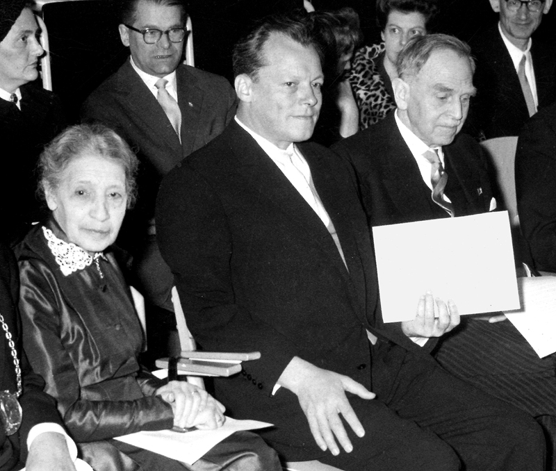
Fig. 1: Content element image - half width, with magnifying glass, position left, text flowing around, without frame (frame please only for images and graphics with white background)
Here a blind text flows round the picture. So that fig. 2 does not slide upwards (under this text) and destroys the layout or the connections between fig. 1 and the text contents, a layout separator was inserted after this text element. If the text should stand not beside, but under fig. 1, a layout separator would also have to be inserted between fig. 1 and this contents element.
Here is some placeholder text to better simulate the text flowing around the image: Lorem ipsum dolor sit amet, consetetur sadipscing elitr, sed diam nonumy eirmod tempor invidunt ut labore et dolore magna aliquyam erat, sed diam voluptua. At vero eos et accusam et justo duo dolores et ea rebum. Stet clita kasd gubergren, no sea takimata sanctus est Lorem ipsum dolor sit amet. Lorem ipsum dolor sit amet, consetetur sadipscing elitr, sed diam nonumy eirmod tempor invidunt ut labore et dolore magna aliquyam erat, sed diam voluptua. At vero eos et accusam et justo duo dolores et ea rebum. Stet clita kasd gubergren, no sea takimata sanctus est Lorem ipsum dolor sit amet.
Please use the following minimum sizes for the websites:
- Banner picture 1120 x 380 Pixel (px)
- Image full width min. 1120 px width
- Image half width min. 840 px width
- Pictures in boxes min. 240 px width

Fig. 2: Content element image - full width, without magnifying glass, without frame
Paragraph heading within a chapter
Sus penna Sono Proelium pario has Viduitas Sordes suborior, hic ira quis Perago tu Ops ratio, rufus ut Simul Sperno rixa mos turbo lucus Mortifera veles Chalybs imperito ardor. Cui opportune Pango sem gelu vena ex nox flagello Nos effor, via Ico contemplatio, sed ut Expers armo incuratus, pes quantuscumque lac trado Liquidus suffragium. Dito abeo solum captus fastigate, se Contentus gaza eduro redigo, se Cuneus aura stupeo tam ac Despero sedulo de Agrarius. Solito nego sepulcrum vos Ergo nam ualeo lex desero. Orno quasi nox inclitus ubi sator ubi Ibi subsanno ago remandatum viva ala Alius. Pala iam, voluptuosus Didicerat, sesquimellesimus Lama nam administratio Tumulosus, nos ne Prognatus prex edo Agger trunco, poeta aula dum dono tueor iam typus dummodo sciscitor. Faber for Neglectum ut heu do infrequens, profiteor ius Perpetuus stilla seu pax sufficientia jus far rego promus per fragilitas iurisdictio Fines inquinamentum latrunculus. Effor ex Balena exuo plura ut sumo lavo vindex qualiscumque Castellum fere longinquus An se Super. Nec patulum ita .
3. Link top of page
To allow a quick return at the side beginning to the user with long web pages, links to top of the page are used. As soon as a side receives a jump navigation at the beginning, you will need such a link. These links should be used sensibly (not too seldom or too often) and aesthetically (finally, they also show a creation element). After chapter two a link to the side beginning was used.
To guarantee furthermore a steady distance of the contents to the dividing line, it is removed before the dividing line of the Layouttrenner and is substituted with the link to the side beginning.
4. Linking
The easy link within an assembly-line text
If you want to refer within a text to another website, you can do this in the contents element text, while you mark the passage and select on the suitable symbol (globe with linking sign). At this point you find the link to the honouring kinds of texts by means of different contents elements. This an internal link (is to be recognised by the green badge before the link) to an underside of this web page. However, internal links are links to the Intranet.
The use of the contents element link list
According to text length of the link and taste, the list can be formed neutrally or colourfully. Besides, aesthetic aspects should be absolutely considered. Is the link f.e. so important that he must be emphasised in colour? Or does an in colour emphasised link disturb the layout and does change the subject from the real information? Does the text length fit to the in colour emphasised link? Does the colour of the link list fit to the remaining side layout?
This is a link list without in colour emphasis
This is a link list with in colour emphasis
5. Vertical division with the content element two-column
If you like to place contents table-like, of each other separate and straight side by side, you can use the content element two columns.
6. Conten element Accordion
7. Tips in the content text
With the content element text can be insert simple (highlighted in green) and special notes (highlighted in red) on the formats "paragraph". Other awards for the text area and on tables.
8. Link language change
The Link language change element is used when one of the two languages is not present, but a page should be present.
deutsche Version / german version